Storybook docs 애드온 적용하기
Storybook Docs는 컴포넌트 스토리들을 문서로 변환해주는 스토리북 애드온입니다.
DocsPage와 MDX 방식이 있습니다.
DocsPage
zero-config로 기본 제공됩니다. 전체 스토리는 매칭되는 DocsPage를 갖습니다.
component 파라미터
스토리북 5.2 버전에 처음 추가된 component 파라미터는, 컴포넌트의 description과 props, 향후 추가될 스펙을 추출하기 위해 사용됩니다.
import { Badge } from "./Badge";

export default {
	title: "Path/to/Badge",
	component: Badge, // Component 파라미터
};
subcomponents 파라미터
여러 컴포넌트를 같은 페이지에 문서화해야 할 때 유용합니다. 예를 들어, List와 ListItem 컴포넌트는 서로 떨어져서는 의미가 없습니다. DocsPage는 component 파라미터를 통해 “primary” 컴포넌트를 지정하고, 추가로 subcomponents를 지정할 수 있습니다.
import { List, ListHeading, ListItem } from "./List";

export default {
	title: "Path/to/List",
	component: List,
	subcomponents: { ListHeading, ListItem }, // Subcomponents 파라미터
};
subcomponents 객체의 키값이 탭의 타이틀과 일치됩니다.
DocsPage 슬롯
-
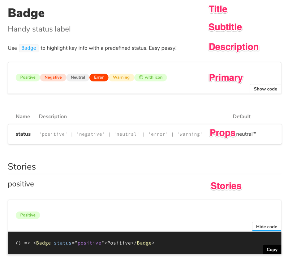
Title
컴포넌트의
title에서 가져온다 . 스토리북 네비게이션의 컴포넌트 캡션과 매칭됩니다.export default { title: "Path/to/Badge", }; -
Subtitle
컴포넌트의
componentSubtitle파라미터에서 가져옵니다.export default { ... parameters: { componentSubtitle: 'Handy status label', }, }; -
Description
컴포넌트 소스의 docgen 주석 내용이 해석되어 표시됩니다.
/** * Use `Badge` to highlight key info with a predefined status. */ export const Badge = ({ status, children }) => { ... } -
Primary
CSF(Component Story Format) 스토리 중 첫번째로 정의된 컴포넌트가 표시됩니다.
// export default { ... }; /* Badge component metadata */ export const allBadges = () => ... // 이 컴포넌트가 primary 슬롯에 노출된다. export const positive = () => ... export const negative = () => ... -
Props
컴포넌트의 docgen props에서 가져온다. 타입스크립트 또는 리액트의 PropTypes로 정의할 수 있습니다.
/* * docspage Props 슬롯에 타입이 표기됨 */ export type Badge = { status: "positive" | "negative" | "neutral" | "error" | "warning", }; // ... Badge definition ... /* * docspage Props 슬롯에 기본값이 표기됨 */ Badge.defaultProps = { status: "neutral", }; -
Stories
CSF(Component Story Format) 스토리 중 첫번째를 제외한 나머지 스토리가 표시됩니다.
// export default { ... }; /* Badge component metadata */
export const allBadges = () => ...
export const positive = () => ... // 이 컴포넌트 이하로 Stories 슬롯에 노출된다.
export const negative = () => ...
MDX
기본 제공되는 DocsPage를 커스텀하고 싶다면, MDX 형식으로 long-form 마크다운 문서를 작성할 수 있습니다.
import { Meta, Story, Preview } from '@storybook/addon-docs/blocks';
import { Checkbox } from './Checkbox';
<Meta title="MDX/Checkbox" component={Checkbox} />
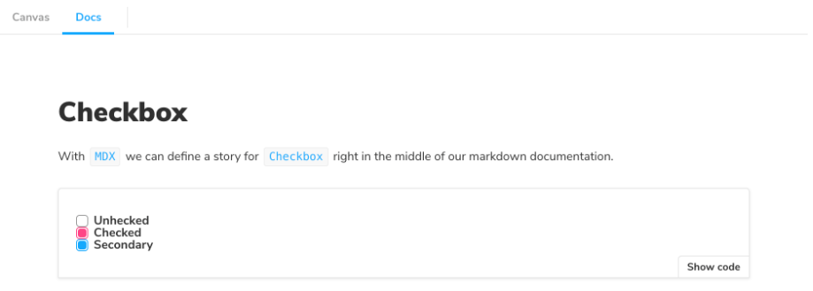
# Checkbox
With `MDX` we can define a story for `Checkbox` right in the middle of our
markdown documentation.
<Preview>
<Story name="all checkboxes">
<form>
<Checkbox id="Unchecked" label="Unchecked" />
<Checkbox id="Checked" label="Checked" checked />
<Checkbox appearance="secondary" id="second" label="Secondary" checked />
</form>
</Story>
</Preview>